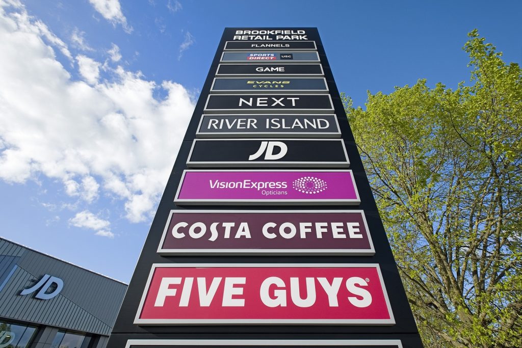
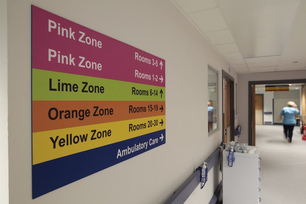
The first step in signage design is understanding the purpose. Whether it’s for a business, school or hospital, the sign should convey clear and concise information. The use of bold, legible fonts and high-contrast colours can enhance readability, especially from a distance or in poor lighting conditions.


Factors in signage design
The size and placement of the signage are crucial. You will make your signs large enough to be easily seen, but not too large to be obtrusive or in violation of local regulations. Placement should consider the line of sight of the intended audience, whether pedestrians, motorists, or both.
In the UK, there’s a strong emphasis on accessibility. Design signs to be inclusive and take into account people with visual impairments or cognitive disabilities. This might involve using tactile elements, Braille, or simple, easy-to-understand symbols.
The design should also consider the local environment and architecture. In historic or conservation areas, for example, signage should be sympathetic to the existing aesthetic. This might involve using traditional materials or design styles.
Sustainability is becoming increasingly important in signage design. Companies should consider the lifecycle of their signs, opting for durable materials and designs that can be easily updated or recycled.


considerations
Designing signage is a multifaceted process that requires a deep understanding of the purpose of the sign, the audience, local regulations, and environmental considerations. It’s a blend of art, science, and social responsibility, creating signs that inform, direct, and enhance our public spaces.
The Don’ts of designing effective signage
Designing effective signage is an art, and there are several common mistakes that can hinder their effectiveness:
Poor Visibility: The sign should be easily visible from a distance. Using small fonts, low contrast colours, or placing the sign in a location with poor visibility can make it difficult for people to read.
Overcrowding Information: Trying to fit too much information on a sign can make it confusing and hard to read. It’s important to keep the message concise and to the point.
Ignoring your Audience: The target audience should be kept in mind when designing the sign. For example, children should find the sign easy to understand with the use of simple language and engaging visuals.
Inconsistent Branding: Signs are often a part of a company’s branding. Inconsistent use of colours, fonts, or logos can confuse customers and dilute the brand image.
Neglecting Accessibility: Signs should be accessible to everyone, including people with disabilities. Ignoring accessibility guidelines, such as not including Braille for the visually impaired, is a common mistake.
Signs Not Being Updated: Signs should always be kept up to date. An outdated sign can provide incorrect information and can reflect poorly on a business or institution.
Ignoring Local Regulations: Each city or region may have its own regulations regarding the size, placement, and type of signs allowed. If you disregard these regulations, fines may be imposed or the sign may be taken down.
Avoiding these common errors can help create effective signage that serves its purpose well. Remember, a well-designed sign can be a powerful tool for communication.


WHY CHOOSE nORSIGN gROUP lTD
All of our design team are qualified graphic designers and have an extensive working knowledge of signage products and fixing methods, so they can advise what kind of design and finished product would work best for you.
Our team would love the opportunity to work with you to design standard signage products as well as truly bespoke pieces which really stand out.
Contact us on 01698 713399 or sales@norsign.co.uk if you are unsure of where to start with your design or the sign types you require.
